Column
The 44% Your Sentiment Dashboard Can't See: What 70,000 Support Conversations Revealed
Across 70,000 support conversations, sentiment was positive but the problem went unsolved in 44% of cases. Customer satisfaction estimates correlated better with actual ratings than sentiment scores (0.47 vs 0.36). If your NPS is flat but churn keeps climbing, this research explains why — and what to measure instead.
Hello. This is Keito Inoshita from Affectosphere Group.
Many organizations use sentiment analysis scores as a core KPI for customer support.
The logic is reasonable. Measuring whether the overall tone of a conversation was positive or negative serves as a proxy for satisfaction. Text analytics tools are widely available, and when your dashboard shows a row of green scores, it feels like things are under control.
But here is a pattern worth examining.
Sentiment scores look fine. NPS is not moving. Churn is not improving.
A study published on arXiv in June 2026 (Jason Potteiger, arXiv:2606.19698) offers a direct explanation. The researcher analyzed 70,450 support conversations from an online fundraising platform and found something concrete about what sentiment analysis systematically misses.
Three takeaways for today
- Satisfaction estimates (measuring whether problems were actually solved) correlated higher with actual customer ratings than sentiment scores did (0.47 vs 0.36).
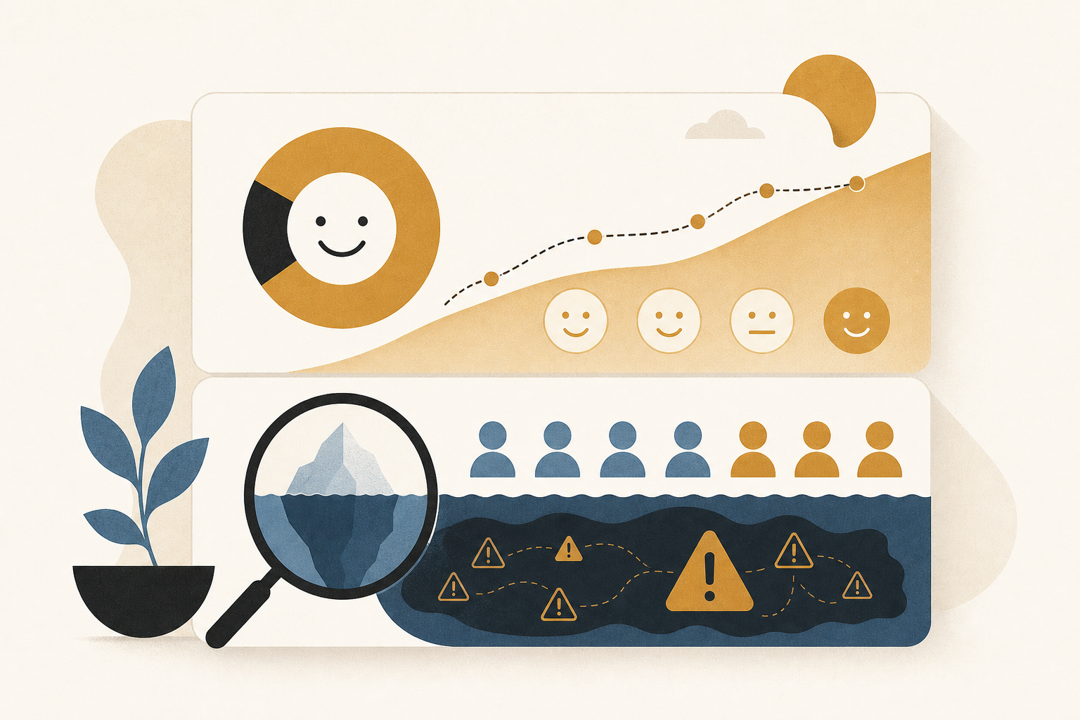
- “Tolerated friction” — conversations where sentiment was positive but the problem went unresolved — appeared in 44% of all conversations.
- Sentiment analysis dashboards are structurally incapable of detecting this pattern.
① Sentiment scores don’t measure whether customers were helped
The core contribution of this research is a quantified demonstration of the gap between sentiment analysis and customer satisfaction.
The researcher compared sentiment scores and separately estimated satisfaction scores — the latter estimating whether the problem was actually resolved — against actual customer ratings.
The correlation with customer ratings was 0.36 for sentiment scores and 0.47 for satisfaction estimates.
The difference is not enormous, but the implication is important.
Sentiment analysis measures whether a customer sounded angry or calm. Satisfaction estimation measures whether the customer got what they came for. These two things look similar but are fundamentally different metrics.
The purpose of customer support is to resolve customer problems. The metric that more accurately reflects that purpose is not sentiment — it is whether the problem was solved. A KPI built on the wrong proxy will give you systematically misleading signals.
② 44% of conversations contained “tolerated friction”
The most striking finding in this research is the concept of “tolerated friction.”
This describes conversations where the tone was positive — the sentiment score looked fine — but the problem remained unresolved at the end of the conversation.
The customer was not angry. The interaction was polite. But nothing was fixed.
From a sentiment dashboard’s perspective, this conversation looks like a success. The score is green. But from the customer’s perspective, they left with the same problem they brought in.
In this study, 44% of all 70,450 conversations showed this pattern.
Nearly half of all conversations appearing “fine” in sentiment terms were actually instances of unresolved problems.
Why does this happen? Customers do not always escalate frustration across an entire conversation. At some point, they stop pushing — not because the issue is resolved, but because the agent was polite and continuing to complain feels awkward. The customer gives up gracefully. The problem stays. The sentiment score stays positive.
This is exactly the kind of experience that precedes a quiet cancellation. The customer does not call in angry again. They just leave.
③ Sentiment scores misidentify dissatisfied customers
There is a second practical failure mode for sentiment analysis in this study.
The research compared how well sentiment scores versus satisfaction estimates identify dissatisfied customers — specifically, how often each produces false positives: flagging a customer as dissatisfied when they actually are not.
Satisfaction estimates produced fewer false positives.
This matters directly for operations. When you run proactive follow-up campaigns to prevent churn, you want to target customers who were not helped — not customers who sounded frustrated but actually got their problems solved, and not customers who sounded calm but left with unresolved issues.
Targeting based on “low sentiment score” mixes those categories together. Targeting based on “problem not resolved” is a more precise instrument.
An implementation proposal for customer success teams
Here is how to translate this research into changes that SaaS, e-commerce, or fintech customer success teams can act on.
The target use case: a customer success or contact center team currently using LLM-based or traditional sentiment analysis for QA monitoring, churn prediction, or VoC analysis.
The first step is adding a “resolution layer” to your existing sentiment pipeline.
For each support conversation, add a classification step that answers: “Was the customer’s problem resolved by the end of this interaction?” An LLM with an appropriate prompt can produce this classification from raw conversation text — this is essentially the approach this study used. You do not need to rebuild your whole analytics stack. You are adding one more output field.
The second step is redesigning KPIs around a two-dimensional matrix.
Once you have both sentiment and resolution data, you can track four categories:
Positive sentiment + resolved → ideal outcome Negative sentiment + resolved → difficult but successful Positive sentiment + unresolved → “tolerated friction” — requires follow-up Negative sentiment + unresolved → clear failure case
Sentiment-only monitoring sees only one dimension and misses the third category entirely. Adding “tolerated friction rate” as a standing monthly metric gives you visibility into the risk that currently does not appear in your dashboard.
The third step is building a problem-category taxonomy from tolerated friction conversations.
The research also demonstrated that it is possible to identify what went wrong in conversations — not just that something went wrong. Collect the conversations classified as tolerated friction and extract common problem categories from them — payment processing failures, tracking page errors, refund policy confusion, and so on. That taxonomy feeds directly into product improvement prioritization and FAQ content strategy.
If your NPS is flat while churn is rising, tolerated friction accumulation is a strong candidate for the root cause. This analysis approach gives you a direct path to identifying it.
The danger is what you cannot see
We now have a clearer picture of why sentiment scores can look fine while churn keeps climbing.
Customers do not stay angry indefinitely. They accept a polite interaction, give up on the problem, and cancel later — quietly. That is tolerated friction. And sentiment dashboards are structurally blind to it because the signal they track is tone, not resolution.
The solution is not to discard sentiment analysis. It is to add a layer.
Measuring “sentiment” and “whether the problem was solved” as separate dimensions — and tracking the combination — gives you the picture that either metric alone cannot provide. The investment in that infrastructure is likely to deliver outsized returns in churn prevention effectiveness.
That’s it for today!
Reference
- Jason Potteiger (2026). What Sentiment Analysis Can’t See: Measuring Whether Customers Were Helped, and What Went Wrong, across 70,000 Support Conversations. arXiv preprint.
* This article was written in part with AI assistance and may contain inaccuracies.