
Column
The Words Around a Chart Change What You Feel: A Framing Experiment in Data Visualization
Episodic or thematic? When an 800-person experiment varied the text framing around the same mass shooting statistics, emotional valence shifted significantly — and the implications for AI-generated data storytelling are hard to ignore.
Hi, I’m Miura from Affectosphere Group.
When you look at a data visualization, how much does the surrounding text shape what you feel?
A chart of mass shooting incidents is still a chart of mass shooting incidents. The numbers don’t change. The visual marks don’t change. But when the accompanying text shifts from describing a nationwide pattern to spotlighting a specific event — does that change the emotional experience? And if it does, does it affect what people think or support?
A research team published on arXiv in June 2026 (arXiv:2607.00103) asked exactly these questions, in a controlled experiment with 800 participants, using U.S. mass shooting statistics as the test case. The results have a lot to say about how affective context gets designed into data visualization — and what that means for AI-generated data storytelling.
3 Points for Today
- Episodic framing (foregrounding individual incidents) produced significantly stronger negative emotional valence than thematic framing (foregrounding aggregate patterns) — how visualization text is framed matters emotionally, not just informationally.
- Adding annotations to thematic titles barely moved the needle — the emotional effect of framing is not something you can patch after the fact with extra text.
- Framing alone didn’t directly shift policy support, but the strong negative affect triggered under the episodic condition correlated significantly with support for gun regulation — affect acts as an indirect mediator, not a direct driver.
① Episodic vs. Thematic: Two Ways to Frame the Same Data
“Framing” in communication research refers to how information is packaged — the angle, emphasis, and context that surround the content itself.
Two framing types have been studied extensively in journalism and political communication.
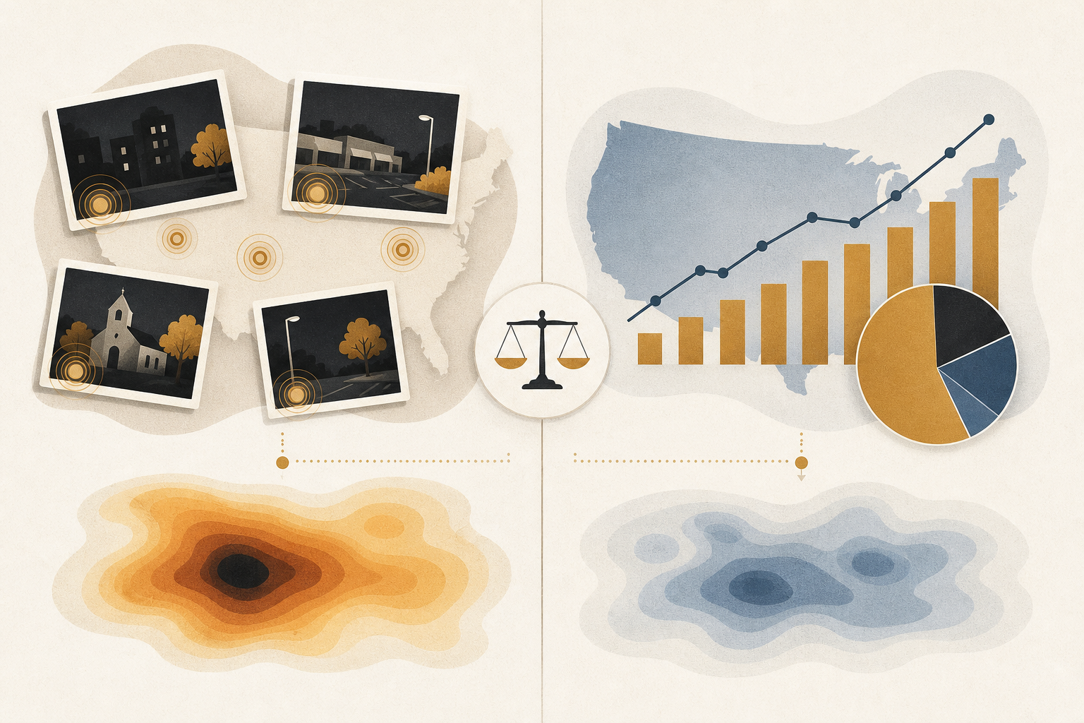
Episodic framing foregrounds individual events. “On [date], in [city], [n] people were killed…” It anchors the data in a specific tragedy, with names, places, and circumstances. The reader encounters not a statistic but an incident. It’s a way of showing data that makes people feel.
Thematic framing foregrounds aggregate patterns. “The U.S. has seen [n] mass shootings per year over the past decade…” It provides the structural view — policy-relevant, context-rich, but emotionally distanced from the individual events that compose it.
Researchers in political communication have long found that these frames have different effects on how audiences process and respond to information. Episodic frames tend to trigger individual-level attributions; thematic frames tend to trigger systemic ones.
What this study brings is a focused question applied to data visualization. The innovation is specific: it isolates the effect of text framing — the title, caption, and annotations surrounding a visualization — while holding the visual content constant. Does the framing of the words around a chart change the emotional experience of viewing it?
② What the Experiment Found
The research enrolled 800 participants and assigned them to conditions that varied the framing of text accompanying U.S. mass shooting statistics visualizations. Some saw episodic framing; others saw thematic framing; a third group saw thematic framing augmented with annotations.
The primary finding: episodic framing produced significantly stronger negative emotional valence than the thematic condition. The same data, framed as individual incidents rather than aggregate trends, generated meaningfully more negative affective experience.
This is a measurable shift in how 800 people emotionally processed identical underlying information.
The annotation finding deserves attention too. When researchers added annotations to thematic titles, emotional response shifted very little. The gap between episodic and thematic conditions couldn’t be bridged by adding supplementary text to the thematic frame.
That’s an important design implication. It suggests the emotional architecture of a visualization is largely set by the primary framing — not adjustable with footnotes or explanatory callouts added afterward. How you frame it at the start determines the emotional structure of the experience. Corrections don’t undo that.
③ Affect as Mediator, Not Direct Driver
The policy support finding is where the picture gets nuanced.
Changing the framing — and changing the emotional response — did not directly translate into shifts in reported support for gun regulation. Someone who experienced stronger negative affect under episodically framed data didn’t automatically report higher support for gun control than someone in the thematic condition.
But the relationship wasn’t absent either. Stronger negative affect, in the episodic condition, correlated significantly with gun regulation support.
The mechanism that emerges is indirect mediation: framing influences affect, and affect correlates with policy orientation — but the causal chain runs through emotional experience as an intermediate variable, not as a direct trigger of attitude change.
For those working with persuasion and behavior change design, this is a meaningful distinction. Emotion may not flip policy positions on its own. But it shapes the emotional state that co-occurs with specific attitudes. In the language of nudge research, it’s more like creating an environmental condition than pushing directly.
From an affective AI perspective, this is a fascinating structure. Emotion might not “change opinions” so much as “produce states that correlate with opinions.” The implication is that emotional context shapes the landscape people inhabit when they form judgments — not by forcing conclusions, but by adjusting the ground beneath them.
④ What This Means When AI Is Doing the Storytelling
The reason I find this research particularly relevant right now is the AI connection.
Data visualization is increasingly narrated by AI. Business intelligence tools auto-generate summaries. News organizations use AI to caption and contextualize charts. Data journalism pipelines produce AI-written explainers at scale.
In every one of these contexts, a framing decision is being made — usually without anyone explicitly thinking about the affective consequences of that choice.
If episodic framing consistently produces stronger negative emotional responses, and if that emotional response mediates political and policy attitudes, then an AI system that defaults to episodic framing is consistently nudging readers’ affective states — and doing so without the transparency that would normally accompany editorial framing choices.
The flip side is a system that defaults to thematic framing, producing emotionally flatter experiences that may leave audiences less engaged with the underlying content.
Neither default is neutral. But in most current deployments, the default is determined by training data distribution and optimization targets — not by conscious design decisions about the emotional experience the system should create.
From an affective AI perspective, this is a design problem that needs to be named before it can be addressed. Framing selection in AI-generated data storytelling is an affective parameter. It should be designed, not defaulted.
Visualization Text Is Emotional Context Design
If you think of the text around a chart as “just explanation,” this research updates that assumption.
Framing is emotional context design. It shapes what viewers feel when they encounter data — and those feelings correlate with how that data connects to their values and policy orientations.
“Objective” presentation doesn’t mean affectively neutral presentation. The choice to frame data episodically or thematically is itself a design decision with emotional consequences. Choosing not to think about that framing doesn’t make it neutral — it just makes it unconsidered.
As AI takes on more of the work of data storytelling, the question of who controls framing, and with what intentions, becomes more pressing. The affective design of AI-generated visualization text deserves the same deliberate attention we’d give to any other consequential editorial choice.
That’s it for today!
References
- Poorna Talkad Sukumar, Maurizio Porfiri, Oded Nov (2026). Comparing the Emotional Impact of Thematic Versus Episodic Framing in Visualization Text. arXiv preprint.
* This article was written in part with AI assistance and may contain inaccuracies.